Documentation
Welcome to Kadu Theme Documentation
Please note: all product images in this theme display as width 100%. If your images are small or low-res, the images will appear blurry and pixelated. Please be sure that if you are using this theme that your images are high-resolution.
Features
- Three colour presets: Classic, Dark, Fusion
- Responsive layout–your store looks great on mobile devices, tablets and desktops
- Supports drop-down menus
- Supports Multiple Languages
- Supports Variant Images
- Integrated social sharing buttons
- Integrated Mailchimp Newsletter Form
Customization
This theme comes with 3 main preset styles that you can choose on theme settings:
Classic

Dark

Fusion

Each style has its own pre-defined set of colors ready to use in your store as shown in the image below:

If any of the pre-defined colors match your brand colors, you can change them to make the store looks pretty well with your brand. A new custom preset is created and you can reset it at any moment. Feel free to play around with the colors to test the different alternatives you can achieve.
This theme comes also with other customizable sections that you can take advantage off to promote your products and to offer a good navigation experience to your customers / visitors:
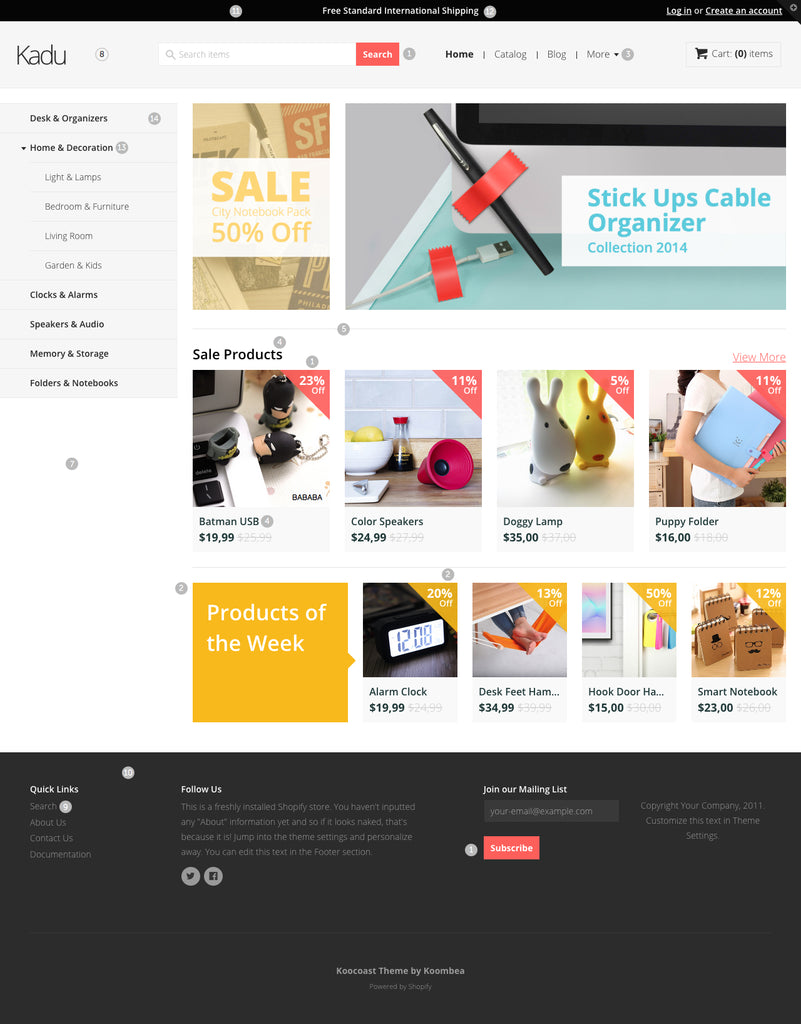
The Sidebar Navigation
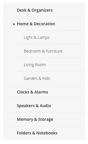
To create a sidebar navigation you just need to create a linklist with a handle of sidebar-nav and that linklist will appear in the aside section of your site. You also can create navigation submenus by creating more linklist and naming them with the name of their respective parents.
The sidebar navigation follows the dropdown pattern recommended by Shopify.
For more information and a detailed explained video, you can follow this link on the Shopify documentation site:
http://docs.shopify.com/manual/your-website/navigation/create-drop-down-menu
Collection Banners
You can upload 2 collection banners to promote your main collections on the homepage of your store.

To do this, just go to your theme settings an open the customization panel. Then go to Home Page tab and upload your collection banners. The recommended dimensions are 363 width x 547 height for the first collection banner image, and 1167 width x 547 height for the second. You can also customize the target collection that will be shown when the users click on the banner.

Featured Collections
You can also set 2 featured collections that appear just after the collection banners. The featured collections can be customized from the same Home Page tab on theme settings.

Featured Collections on theme settings

The TopBar

The topbar appears (as its name says) at the top of your store. This bar contains the main links for your customers authentication and a flash message that can be customized from theme settings, as well as the foreground and background color.

Header

In the header you can customize your brand logo and main navigation menu. By default, the theme takes your shop name and put it in the logo space with a nice and elegant typography, but you can change it for your own logo image from the theme settings in the header tab as the following image shows:

The main menu nav, is the default linklist that shopify created by you when you just created the store. If you changed don't worry it's very simple. Just create a linklist with a handle of main-menu and the navigation menu will appear automatically. You can create as many links as you want and sublinks following the same approach from the sidebar nav.
You can find more useful information about how to customize a theme in the Shopify theme documentation page. If you need more specialized support for this theme don't forget to contact us at contact@koombea.com
Changelog
- November 14th, 2014 - Initial release sent to shopify store.
FAQ
What does responsive mean?
Kadu changes its appearance depending on the screen size of the device it's viewed on. This means your store will look great on most modern devices and functions well. This also means you do not have to worry about installing a separate mobile theme.
What type of images suit this theme best?
High-res images at least 1600px width fit this theme best.